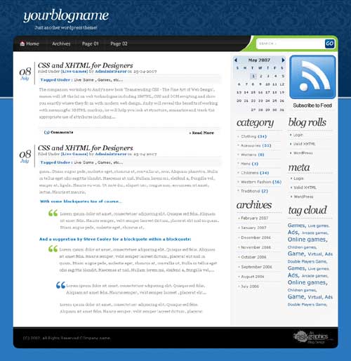
A thoroughly modern design. Although the site is cutting edge and a clean interface it also has old world qualities. With the top half of the navigation looking like heavy flock wallpaper you may find in an old french chateau. This is the contrasted with a sky blue background for the bottom half or more of your web page.
The two differing backgrounds are combined well for two primary reasons. In the first instance the top half of the design first visible when you reach the page fades from the heavy flock effect to a neutral dark blue. This is then further complemented by a 3d effect square edged grey blue bar to help divide the two sections.
The site is further enhanced with a clear top navigation bar which includes an easy to recognize home icon to help your users.
The search function to the right hand side of the navigation in a swoosh of green is a nice artistic touch.

thanks for this theme, I’m using it on one of my blog.
The comments don’t work. I loaded it onto my WordPress 2.6 blog and I get a 500 error when trying to make comment. The submit button is broken to. On the Demo here the submit button works but the submission of a comment results in a 500 error too. Any ideas???
Hello, for first thanks for sharing this theme
I’ve two question, it works with wp v2.7.1? and how I do to translate it in other language like Italian?
Gorgeous theme, I really really really wanted to use it!
However:
Theme has no options for customization ( at least not in wp 3.0) Also the new Menu Editor in 3.0 is not compatible with this theme. I could not even find where to change the banner