RedTweet

Category : Wordpress

31

121

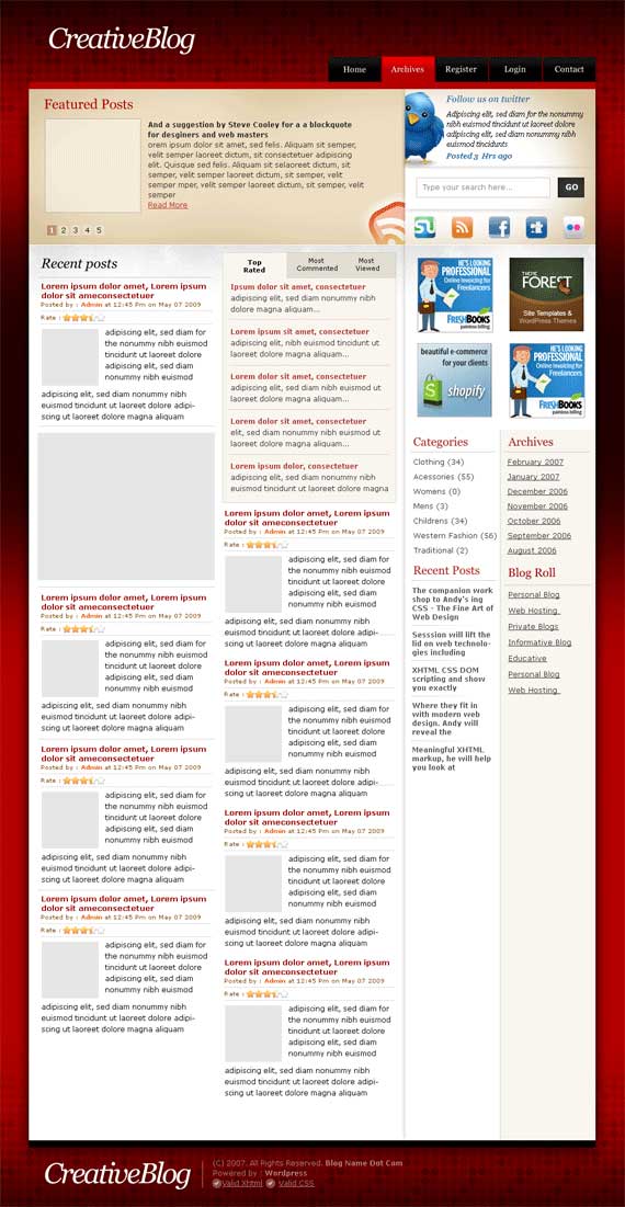
This design features a unique color scheme and navigation. The color is bold and attractive with textured shades of red at the top and bottom and solid in the middle. There are four columns throughout the layout offering a unique and visually appealing view.

|

INSTALLATION
Upload RedTweet folder to wp-content/themes and activate it
Upload Wp-Ratings plugins to wp-content/plugins and activate it
Upload Wp-PostViews plugin to wp-content/plugins and activate it
Upload featureMe plugin to wp-content/plugins and activate it
Upload wp_pageNavi to wp-content/plugins and activate it

How to show posts in Featured section?
In write post of edit post screen, check the feature this post box

How to show small image for each post in featured posts section?
In write post of edit post screen, create a custom field called “thumbnail” and post the url to the image in its value

How to show small image for each post in Recent posts section?
In write post of edit post screen, create a custom field called “image_100_100″ and post the url to the 100×100 image in its value

GreenMag

Category : Wordpress

7

127

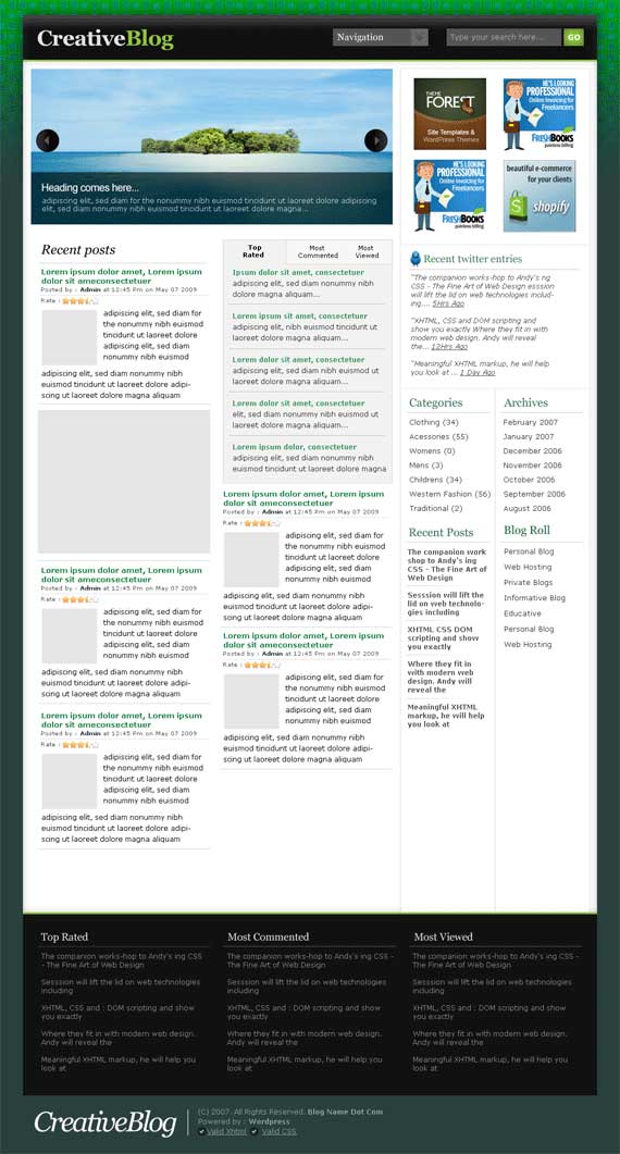
This design is both easy to read and attractive. The background is textured with green and aqua squares fading into on aqua color. The top of the page offers a rotating image gallery. The layout is interesting to the eye and offers a unique perspective that is different than most designs available.

|

StylishRoyal theme

Category : HC, Wordpress

7

17

|

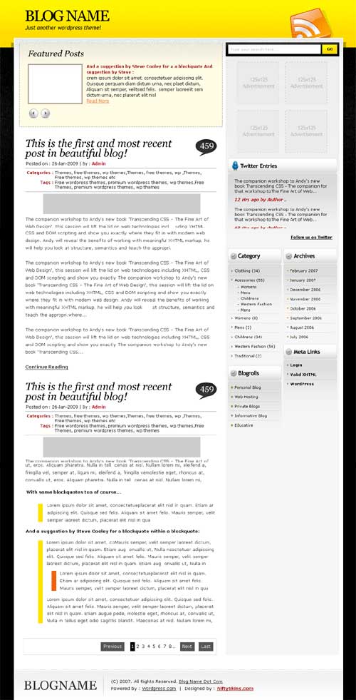
Canary Yellow and black, inspired by the bumble bee. This 3d design is a nice effect and it makes it appear as though your content is sitting away from the web page with the clever use of a drop shadow behind the content box. The design may be a simple two column layout with what appears to be straight edges on the most part however the design is far more complex than that.

A low key approach to curves, shadows and bevel effects leaves you with an extremely tidy page. With more than just a nod in the direction of web2.0 graphics and style. This design will leave your site looking up to date without being too gimmicky.

BlackGrey2 theme

Category : HC, Wordpress

26

19

|

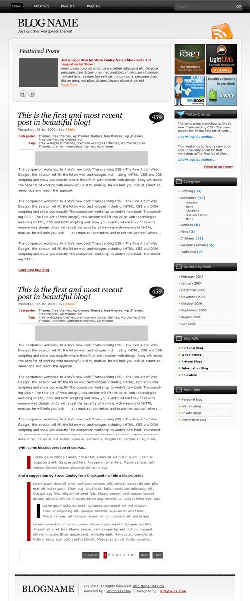
An ultra modern design. This wordpress theme has been designed to be viewed at 100% of your screen resolution. Its a 2 column design which is most definitely web2.0

If your looking for a theme to launch an online product or service, if you want your website template design to evoke the feeling of a cutting edge company, that is hip and understands internet trends then this design will work for you.

A strong black navigation bar at the very top of your page, that runs the width of the site makes the site very intuitive and user-friendly. Clear navigation is just one of the qualities of this free WordPress theme.

It has been designed with the webmaster in mind too, with room for four 125×125 Adverts and and additional 250×50 Advert. Simple effective use of colour with this black, white and grey theme that highlights your RSS feeds.

How to show featured posts?
Put all posts in a certain category and select this category as featured in theme options page.

How to show images in featured posts?
Create a custom field called “thumbnail” and paste a link to 163×119 image in its value for every post you feature.

BlueStyle theme

Category : HC, Wordpress

10

18

|

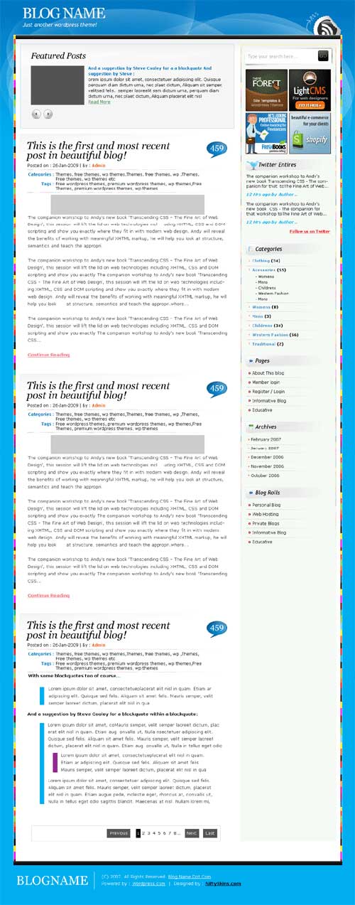
There are a number of very nice design touches to this WordPress theme. The peel away sticker promoting your RSS feed is just one of those extra details which are sure to make your site stand out amongst the crowd.

The theme is primarily blue, the background incorporates a significant amount of smooth curved edges in a random pattern that helps evoke the feeling of calm, and simplicity. The multicoloured striped bars along the sides of the two column layout brings lots of color to the screen without it coming across as gaudy.
A bright fresh design that is sure to leave a positive impression.

BlueUzor

Category : Wordpress

4

|

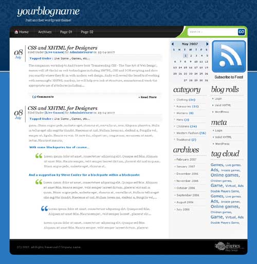
A thoroughly modern design. Although the site is cutting edge and a clean interface it also has old world qualities. With the top half of the navigation looking like heavy flock wallpaper you may find in an old french chateau. This is the contrasted with a sky blue background for the bottom half or more of your web page.

The two differing backgrounds are combined well for two primary reasons. In the first instance the top half of the design first visible when you reach the page fades from the heavy flock effect to a neutral dark blue. This is then further complemented by a 3d effect square edged grey blue bar to help divide the two sections.

The site is further enhanced with a clear top navigation bar which includes an easy to recognize home icon to help your users.

The search function to the right hand side of the navigation in a swoosh of green is a nice artistic touch.

Softy

Category : Wordpress

7

128

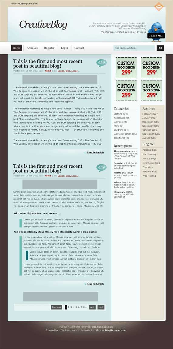
The head of this site is large, offering a space for an embedded twitter update. Below the banner are key navigational links and a search feature for the site. In addition, this design features a double right-hand side bar with archives, partner links, categories, and recent posts.

|

GreenTweet

Category : HC, Wordpress

2

120.11

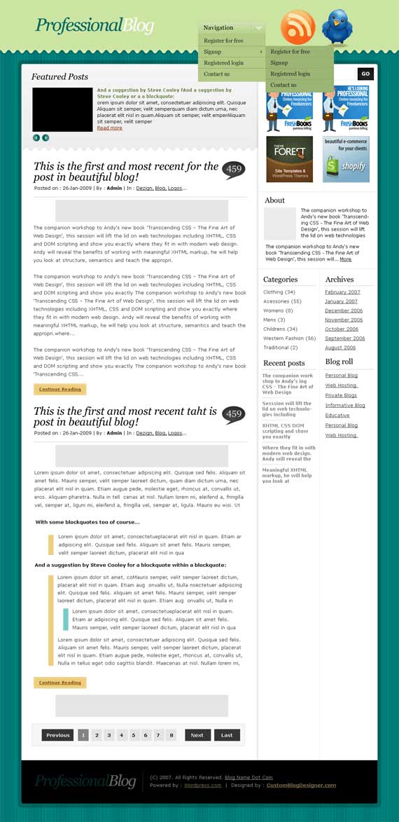
This design is both clean and attractive featuring a wavy line between the header and main page and a textured teal blue background. The main navigation is found within a drop down menu at the very top of the page with in-site navigation throughout the double column on the right hand side.

|

Grunge2 theme

Category : Wordpress

21

|

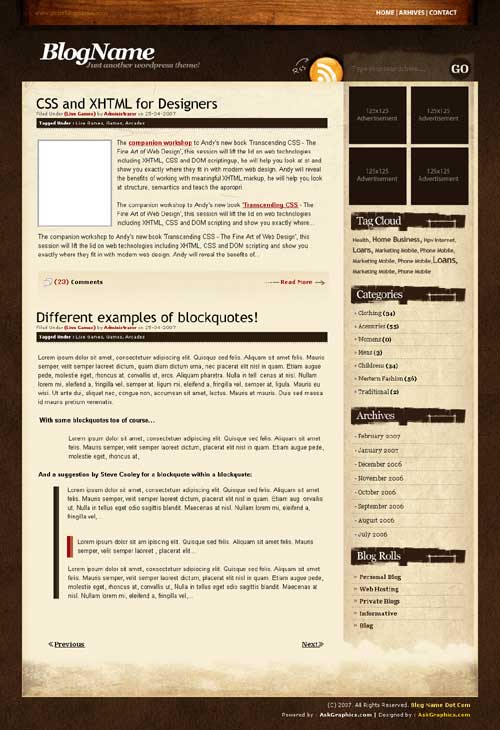
If you are looking for a grungy feel for your website, the take a look at this WordPress theme. Maybe you are looking for a theme for your eco friendly wordpress blog, or a college band. Grunge 2 is a great theme in browns and grays. The nice wood veneer panel at the top of the site would certainly make it of interest to any kind of artists working with wood.

The design is made up of lots of straight edges counter-balaced with the torn paper style headings on the site. This makes the site balanced and not so stylized that it becomes hard for a user to navigate. It comes ready to display four adverts 125 x 125 pixels. This is a popular theme with Emo Bands.

UltraWood

Category : Wordpress

12

|

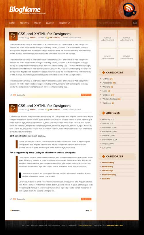
This is 2 column design for your WordPress blog. Your RSS feed is prominently featured within a coffee mug icon to right of your blog. The already prominent RSS icon is further highlighted by a spotlight effects.

A semi-transparent navigation bar and search feature offers a very pleasant effect just one of many examples of outstanding design. The theme includes a wooden floor style background which goes from a natural wood to stained black wood effect in a gradient fashion.

The site includes space for 4 125×125 pixel adverts and you can be sure we have tested this theme for compatibility prior to release.