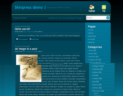
A very nice little WordPress theme that has a portal like feel with its extensive use of button style icons at the top right hand side of the navigation. Inspired by night skies, this design utilizes web2.0 drop down shadows, clean rounded edges and bevelled finishes.
Todays date is incorporated into the header, giving you an easy way for your site to always ‘appear’ fresh to a first time visitor.
Background incorporates nice gradient from a dark gray blue to aquamarine and this background is possibly the strongest element of this theme. To fully appreciate the design please do take a look at the demo.


For some reason, I can’t get any images in my blog entries to display on the right. Setting right alignment in the editor results in the image being displayed on the left.
Any idea what I would need to change to fix this?
open style.css
search for :
.item_class img, #blog_comm img{
float: left;
margin:5px;
}
remove “float: left;” (ignore the quotes) from it
Everytime I post a 450 x 300 image, my “Read more…” tag gets pushed to the top right of the image, instead of below of the image, where I placed it. When you click on the “Read More…”, all the text after the “more” tag is placed on the right as well. Can someone please help me figure this out? Any help would be appreciated.
I think I figured it out. It was the image border, it was set at “0px” on style.css. I just changed it to “1px” and now everything’s where it should be.