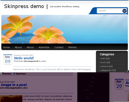
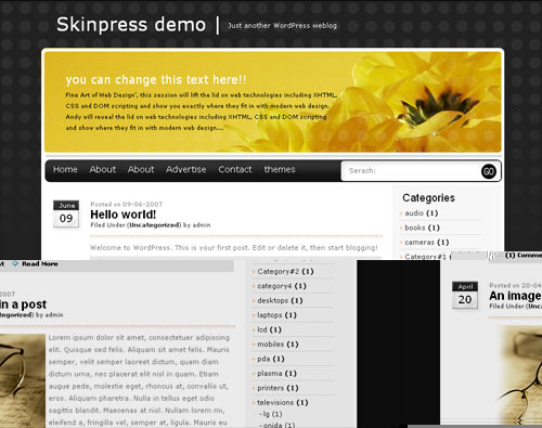
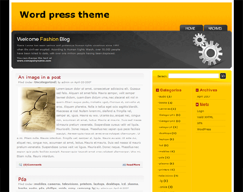
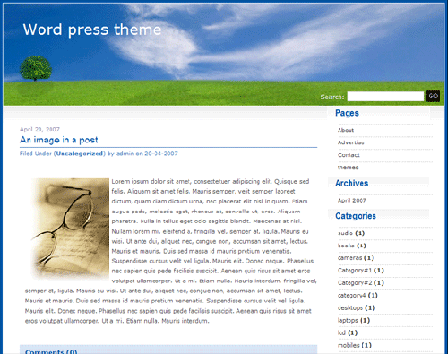
Peach coloured pond lilies form the major component of this delightful design. A search tab that sits above your main graphic makes your site simple to use.
There is plenty of scope within this skin for incorporating your own creative efforts if photoshop is one of your strengths. The Web2.0 style stripey gradient overlay on the central image keeps the design current. Using 100% width of users screen there is no wasted space with this design.
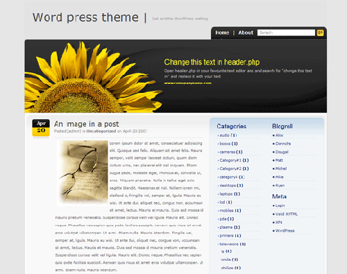
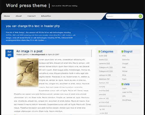
A 2 column design with right had navigation. The right column is slate gray with the main content area being white. This makes it particularly comfortable to read particularly when combined alongside the double line spacing. Your site benefits from some fantastic finishing touches including the nice icons especially the calendar images and a prominent “go” button for the search utility.

