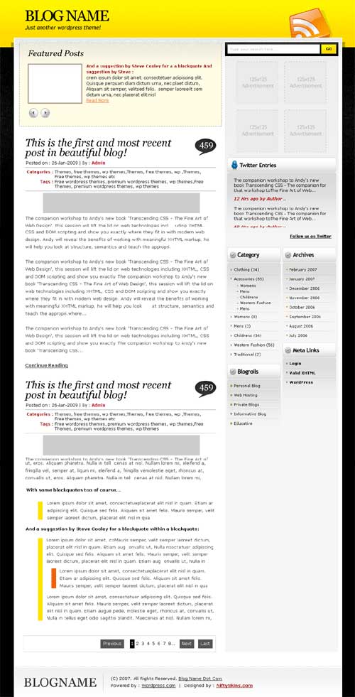
Canary Yellow and black, inspired by the bumble bee. This 3d design is a nice effect and it makes it appear as though your content is sitting away from the web page with the clever use of a drop shadow behind the content box. The design may be a simple two column layout with what appears to be straight edges on the most part however the design is far more complex than that.
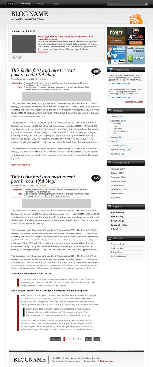
A low key approach to curves, shadows and bevel effects leaves you with an extremely tidy page. With more than just a nod in the direction of web2.0 graphics and style. This design will leave your site looking up to date without being too gimmicky.


